Key points on this page:
- Accessible content is content that's easy to read and easy to access.
- Make sure your content is accessible through positive language, clear content, and accessible headings, images and links.
- Content should put your users at the centre of it.
Summary
Often, when we talk about accessibility, we’re talking largely from a technical side – from aria-attributes to colour contrast, it’s all about the design and development. However, there’s a side to accessibility that often doesn’t get considered: written content.
And this doesn’t need to mean “talking down” to your readers. Many of your users might have the ability to read complex content, but that doesn’t mean that they want to, or enjoy consuming it.
It’s like when you’re using a website: sure, you might be able to navigate through a very broken site, but it won’t be easy, and it will be a very frustrating experience.
In this blog, we will look into what actually defines ‘accessible content’ and how you can make sure that your content is accessible for your readers.
What is accessible content and why is it important?
In general, digital content includes anything from blogs, website content, and eBooks to even PDFs and online documents. Accessible content is content that has been designed to be:
- Easy to read. Your content should be easy to understand for all users, with consideration for people with low literacy; learning disorders; are ageing, don’t have English as their first language; or are recovering from accidents or illnesses.
- Easy to access. Your content should be able to be viewed and understood on different devices, at different internet speeds, and by people with different mobility and vision requirements.
Having content that is produced with accessibility in mind enables us as users to navigate websites with ease, making navigating the web overall a more enjoyable experience.
Guidelines for writing accessible content
Before you jump into creating content, consider the following accessibility guidelines to inform how your content is designed and written:
1. Use appropriate, positive language.
The Victorian Government’s accessible content guidelines state that the person should always be put ahead of the disability. This is called “person-first” language and it is preferred by some people with disabilities. In general, it is usually the better option to go with person-first language when writing content.
However, there is also identity-first language, which is very popular among many people who are neurodiverse or disabled. These people view their disability as a key part of their identity.
Person-first language: “Person with a disability.”
Identity-first language: “Disabled person.”
In general, “person-first” language is more widely used, but it’s important to keep monitoring changes overall and take note if this changes.
2. Make sure that your content is clear and concise.
Your content shouldn’t be unnecessarily complex or wordy. If you can say something in a couple of sentences, do so.
You should also:
- Use list formatting as appropriate for easier readability.
- Consider using images, illustrations, and other media to clarify meaning.
- Always expand upon acronyms the first time you use them.
3. Make your headings and images accessible.
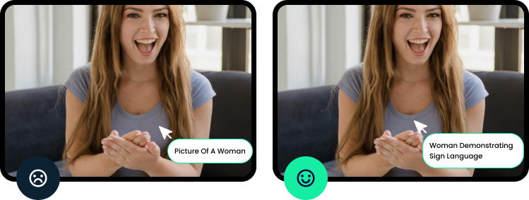
Make sure that screen readers can ‘see’ your images through descriptive, relevant alternative text, as well as understand the layout of your page through heading structure. You can find out more about these requirements here.

4. Ensure that your links are accessible and understandable without context.
With aria-labels, we can add certain things to the code to make sure that screen readers understand the purpose of the link.
An example might be
<input type=”number” aria-label=”country code”>
in a contact form.
However, this doesn’t mean that you should give up entirely on making the actual content of those links accessible.
Button and link text like “learn more” doesn’t say enough about where the link will take you – and if you’re using a screen reader, you might be tabbing through a website very quickly, so context is key!
Change your “learn more” so that it’s relevant to where the link is going. For example, “learn more about our services” or “find out about our organisation”.
5. Avoid using word docs and PDFs – and if you have to, make sure it’s digital-first.
With modern technology and websites, we just don’t need to be uploading word documents or PDFs. If a PDF or Word Doc is absolutely necessary, make sure that it’s designed so that it’s catered to digital (or you create a digital-first version) instead of print.
Microsoft, for example, allows for a variety of different accessibility options, including accessibility tags for screen readers. You can also run the Accessibility Checker within the document to make sure your content is easy to read and edit.
6. Provide text equivalents for video content and other multimedia.
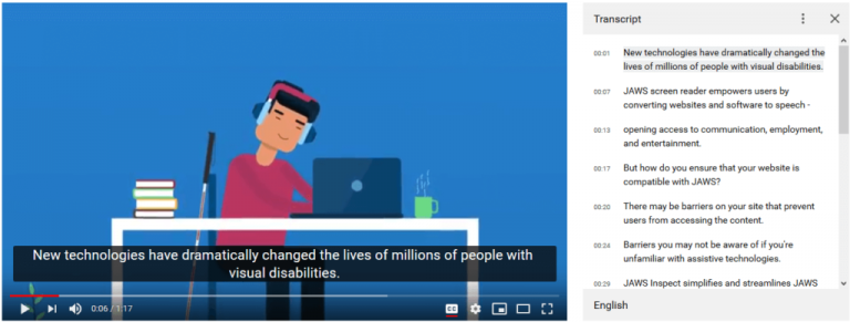
Whether it’s adding video captions or a full transcript, make sure that you’re providing a text equivalent for the user. And don’t just turn on auto captioning and be done with it – often, this is inaccurate and can cause even more confusion.

Genuine, human-centred content matters
There are a great many things that websites can do for us nowadays. But when it comes to tailoring content for all your users, make sure you consider humans first and ensure that it is inclusive of everyone. Words definitely matter, so ensure that you’re putting real, useful meaning into them.
At Dux Digital, accessibility is ingrained into all of the work we do: from the websites we build to the content we create.
If you are striving to make accessibility a focus for your ongoing content creation strategy or new website, get in touch with us here to find out how we can help you.