Key points on this page:
- Accessible design provides a more inclusive experience for all.
- There are lots of different factors, like colour contrast and keyboard navigation, that are all a part of website accessibility.
- Website accessibility is not a one-time task but an ongoing process. It requires regular management and revision to ensure continuous improvement.
Summary
Accessible design ensures that websites are more inclusive and usable for all users.
Features – and barriers – of accessibility surround us in our everyday lives. Accessible design enables users to use websites regardless of visual, auditory, motor or cognitive ability.
People who need accessible design might be using screen readers, may navigate a website only through a keyboard, or may need to zoom in more than the average person to be able to read text.
If you’re looking to design and build an accessible website, there are a few methods through which you should test your website before it goes live.
Test 1: Screen readers
Those with sight loss often use screen readers to navigate the web. These are essentially navigators that read the website to users and enable them to use it. There are lots of easily accessible screen readers, from Mac OS’ own navigator to the ChromeVox extension.
When checking that your website is screen-reader-ready, you should ensure that:
- You added alt text to all relevant images (excluding decorative ones).
- You use headings, and in the right hierarchy. These headings should be useful to the user and follow a natural structure. Screen readers can use headings to navigate content, so they’re especially important in helping the user navigate the web page with ease.
- You make good use of aria-attributes to tell the screen reader what to observe and what not to observe. Aria-labels provide contextual information to the user so that they can understand what next steps they should take. We can use certain aria labels to signify whether an element is purely decorative, or if it has a purpose.
For example, if we have an image that only exists as part of the page design, we can give it the aria-hidden=”true” state or use role=”presentation” (though this is not supported by all browsers so is not always the best option).
Test 2: Colour contrast
Have you ever used a website and had to squint to read the text, with the colours all bleeding together? For some people, poor colour contrast does more than just strain their eyes – it prevents them from navigating the web.
People with low vision face barriers when navigating websites with poor colour contrast. There are a few different types of “colour blindness”, such as:
- Monochromacy: When a person cannot see colours at all – only black, white and shades of grey.
- Tritanopia: When a person can’t differentiate between blue and yellow.
- Deuteranopia: When a person can’t distinguish green colours.
- Protanopia: When a person cannot distinguish red hues.
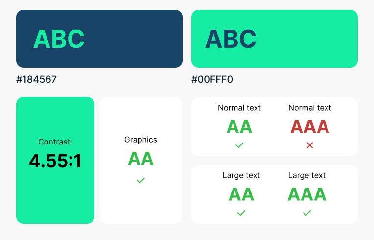
WCAG 2.1 requires a contrast ratio of at least 3:1 for graphics and UI components, such as form input borders, and 4:5:1 for normal text. The higher the contrast ratio, the easier it is for somebody with low vision to view or read.

Larger text has a lower contrast ratio requirement, because text that is larger with wider character strokes is easier to read at lower contrast. As a result, the contrast ratio for larger text (generally over 18 point) is only 3:1.
Test 3: Try your web-page at 400% zoom
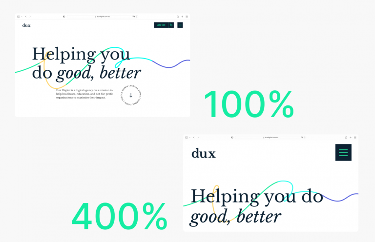
The default zoom level on a browser is 100%. Many different types of users benefit from text size enlargement, including elderly people and those with visual impairments. As a result, it’s an accessibility requirement that the text on a web page can enlarge up to 200% without the loss of information.

Ultimately, while your layout may change, the text must remain readable.
To meet WCAG 2.1 Level AA, your website’s content must be understandable as per the below:
- Vertically scrolling content at a width equivalent to 320 CSS pixels (roughly 400% zoom).
- Horizontal scrolling content at a height equivalent to 256 CSS pixels (roughly 400% zoom).
Some high-level ways you can ensure your web-page meets the above criteria include using relative units for sizing (ems, rems, percentages), using legible font sizes, and providing sufficient space between columns of text to avoid text overflowing their containers.
Test 4: Check how descriptive your links are
For those using assistive technology, navigating to different pages can be difficult without descriptive links. Descriptive links allow screen reader users to tab through links on a webpage without requiring context to understand where the link will send them. As a whole, though, descriptive links just help users in general to navigate your website with ease.
A descriptive link should tell the user exactly where they’re going and what they’re clicking on. WCAG 2.1 requires that:
“The purpose of each link can be determined from the link text alone or from the link text together with its programmatically determined link context, except where the purpose of the link would be ambiguous to users in general.”
Non-descriptive link examples:
- Read More
- Learn More
- Click Here
Descriptive link examples:
- View Our Case Studies Page
- Read Our Blog Articles
- Find Out More About Our Services
There are ways that you can provide context to a link through coding, however it is always preferable to make the link text itself descriptive where possible and add these in addition to that.
With aria-attributes, you can add “aria-label” or “aria-labelledby” to provide context to your links:
Aria-label: The aria-label attribute is read out by the screen reader instead of the link text.
Aria-labelled by: The aria-labelledby attribute replaces the link text, and allows developers to reference other elements on the page (like a heading) to define an accessible name. This is useful for when another element on the page is sufficient for summarising the link text.
Test 5: Navigate the website with just your keyboard
Keyboard accessibility is generally considered one of the most important aspects of website accessibility. Many different types of users require keyboard accessibility to navigate websites, including users who have visual impairments or who have limited or no use of their hands.
WCAG 2.1 states that all content functionality should be operable through the keyboard interface “without requiring specific timings for individual keystrokes”. Essnetially, the website’s content must be accessible through the keyboard without needing to hold down keys for a certain amount of time, or press a key quickly multiple times.
As part of this, it’s important that you can tab to every link, button and form control, in a logical navigational order.
Your website should also use ARIA properties or roles to highlight an element in keyboard focus. Keyboard focus outlines an element to show where you are on the web page, which is especially useful for those with low vision.
As a result, an element’s focus should always be clearly visible.
Website accessibility and the future of web
Website accessibility can seem daunting, but if you follow the key points above, you’ll be on your way to a much easier-to-use website with improved accessibility. It’s important that we take steps towards making our websites usable by all users.
Having an accessibility website is an ongoing process, and one that can – and should – be managed and revised over time.
If having a website that’s navigable by all users is important to your organisation, get in touch with us here to find out how we can help you.