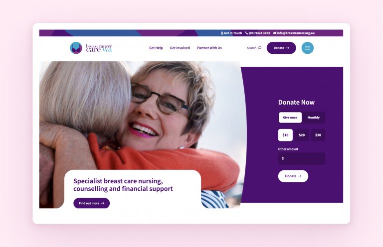
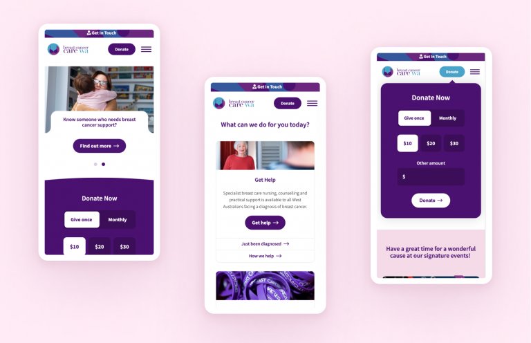
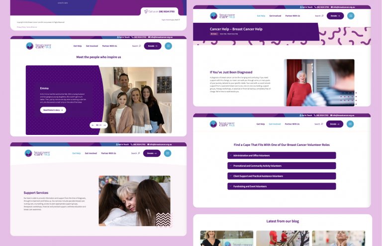
When people are seeking out help for either themselves or a loved one, they want to come to a place that’s comforting, homely and easily accessible. That was the approach we took with the Breast Cancer Care WA website.
The brief
- Breast Cancer Care WA provides free nursing, counselling and financial support to those affected by breast cancer.
- BCCWA’s website needed to be friendly and easy-to-use to accommodate people looking to get help, give support, or to partner alongside them.
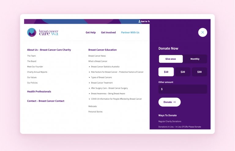
- The challenge in designing the website was the sheer amount of information that had to go on there.
The results
- Through an in-depth and collaborative discovery session, we defined an appropriate strategy with the client and its stakeholders.
- We simplified the user experience by splitting the website into three key areas: ‘Get help’, ‘Get involved’ and ‘Partner with us’.
- For users seeking help, we offered a variety of contact methods: call back, email through, click to talk, and others. For users looking to get involved, we integrated with the Salesforce API to allow users to toggle between once-off and recurring donations.
What we did
- Wireframe design
- User research
- Website design
- User journey mapping
- UX/UI design and prototyping
- WordPress Development
